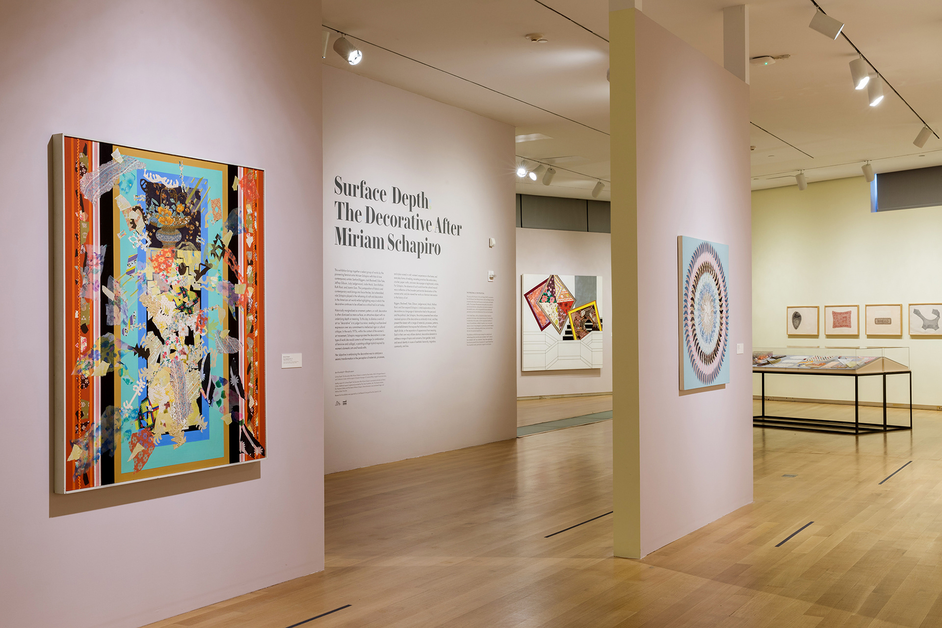
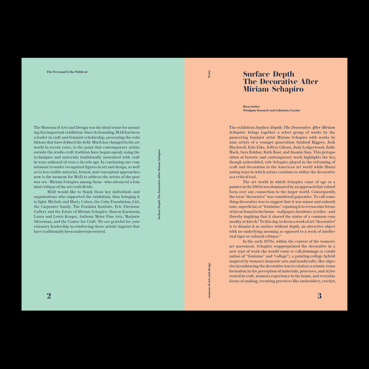
In creating the exhibition identity for Surface/Depth: The Decorative After Miriam Schapiro at the Museum of Arts and Design, we chose Le Jeune, by Commercial Type, for it's sturdy letterforms and ornate ball terminals. The font paired well with our “decorative type-interventions”, and the Schapiro-inspired exhibition color palette. All to celebrate Schapiro and the elevation of "the decorative".
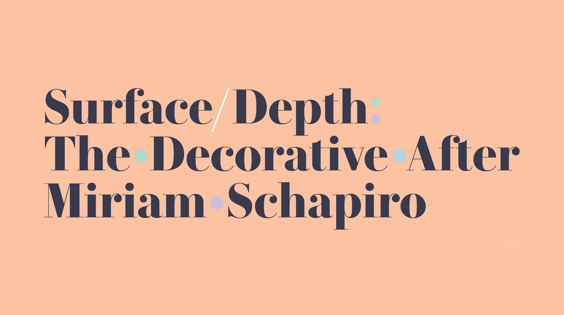
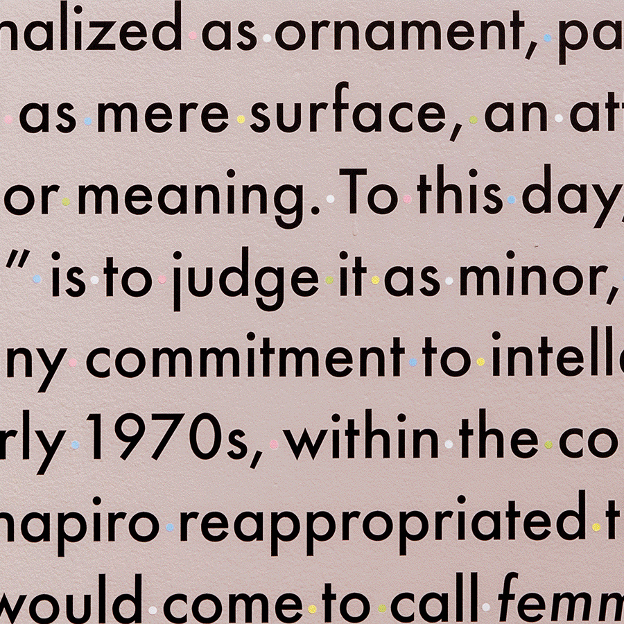
To further champion the decorative and things seen as "excessive" the title wall and main display typography featured alternating colored dots between every word.
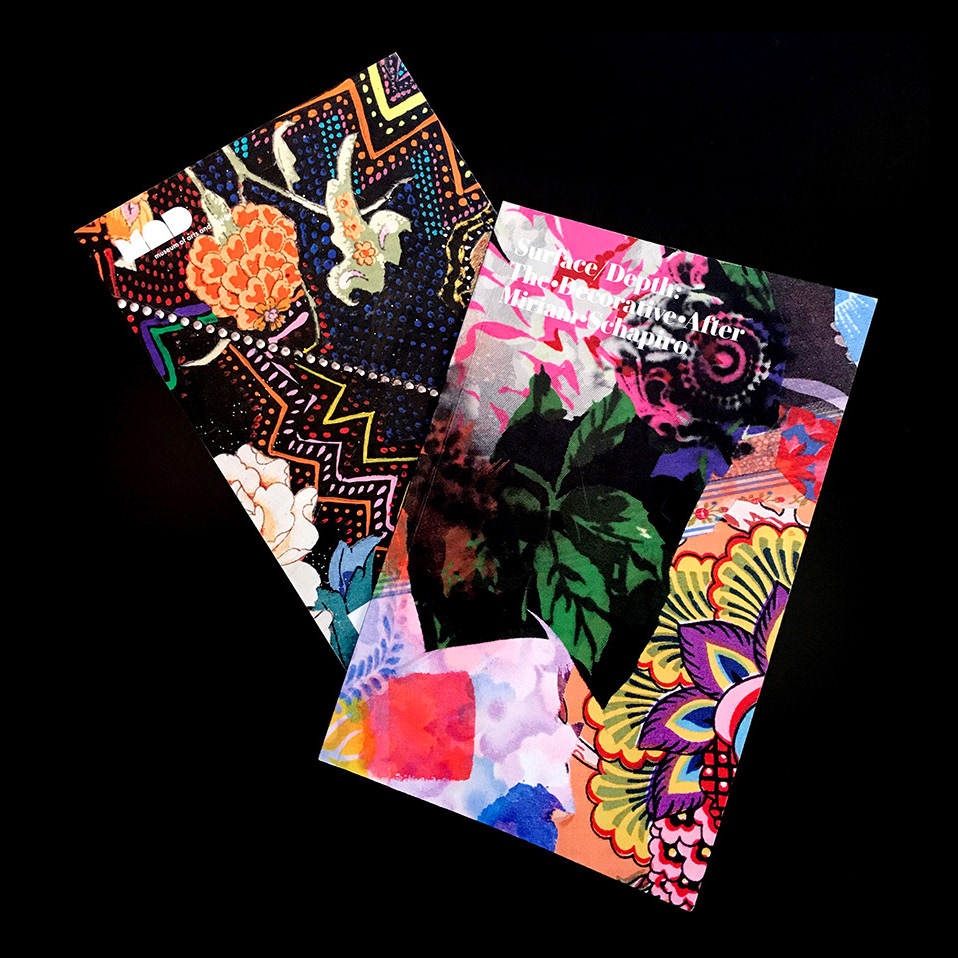
The exhibition catalog also made subtle "decorative" interventions throughout the layouts and featured essays by Shannon Stratton and Elisa Auther.
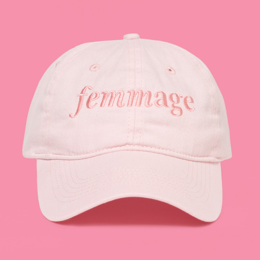
The show's core piece of promotional swag was a pink hat with Shapiro's famous neologism proudly stitched across the front.
Curators: Elissa Auther & Angelik Vizcarrondo-Laboy. / Cheif Curator: Shannon Stratton. / Exhibition Design: Hendrik Gerrits & Willow Holdorf. / Creative Direction & Design: Joshua Graver. / Installation photography jenna bascom.